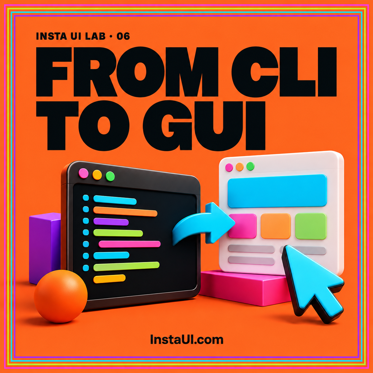
A command-line tool can expose a precise, powerful workflow while asking its users to remember too much. A graphical interface can make the available choices visible, explain unfamiliar options, and organize results. That improvement depends on preserving the command's meaning. A polished screen becomes frustrating when a developer cannot tell which files it will touch, why a run failed, or how its choices relate to the tool they already use.
Start with one concrete task: preparing a local documentation build, checking a configuration bundle, or comparing two exports. Treat the interface as a way to explain that task. This guide develops a practical design process that can be reviewed with a static prototype before any local process runner or remote execution service exists.
Map a task before mapping flags
Observe the sequence a person follows around the command. A documentation build may involve selecting a project, identifying an output directory, choosing a build profile, reading warnings, and opening the generated files. The command occupies one part of that sequence. A screen containing every available flag in alphabetical order would reproduce the reference manual without helping the person finish the job.
Write the task as an outcome and identify the decisions needed to reach it. Group those decisions by purpose: source, destination, behavior, and output. Put frequent choices in the main flow. Place advanced choices behind a clearly named disclosure when the interface is eventually implemented. The CLI Insta UI topic guide provides a useful starting point for organizing command-oriented interface content.
Define the execution boundary in plain language
Decide whether your future interface will generate instructions, run a local program, or send a request to a service. These are different products. A command generator can explain and copy a command without observing its execution. A local runner needs an authorized connection to the machine. A remote runner needs a defined service, job identity, and response contract.
A static design should identify which of these behaviors is being illustrated. Show a sample result as sample output, with a short description of its scenario. Avoid a working-looking Run button that only changes a success badge. For an educational page, a readable workflow example is often sufficient. Reviewers can assess labels and hierarchy without mistaking a staged screen for an execution environment.
Translate command semantics into an interface contract
Build a small inventory for each option: its purpose, allowed values, default, dependency, and effect on output. For an existing Python tool, the official argparse documentation explains positional arguments, value-bearing options, flags, defaults, and choices. Use the actual parser definition as evidence for the interface contract; do not infer rules from the appearance of one example invocation.
The design work begins where the inventory ends. A profile called “strict” needs a useful explanation of what becomes stricter. An output path needs to distinguish an existing directory from one that will be created. A default should be visible when it meaningfully affects the result. When two options conflict, explain the conflict at the decision point so the user can resolve it before considering execution.
Keep a readable relationship with the command
Developers should be able to connect a screen's choices to the underlying operation. A command preview can serve this purpose, but only if it reflects the selected configuration accurately. Display the executable, working directory, relevant environment assumptions, and output destination separately when one long line would be difficult to inspect.
For design discussion, this illustrative job description captures intent without pretending to be executable code:
Operation: build documentation
Source: sample-project/docs
Profile: review
Destination: sample-output
Existing output: preserve until replacement is ready
When implementation begins, command construction deserves its own technical review. Do not assemble untrusted values into a shell string simply because the visual preview looks correct. Choose a runner interface that accepts structured arguments, and test platform-specific path handling. The preview is an explanation for a person; execution requires a separate, validated representation.
Design output for both scanning and investigation
A terminal stream contains chronology, detail, and repetition. A graphical result view should help someone answer three questions quickly: did the task finish, what needs attention, and where can I inspect the details? Start with an outcome summary. Follow it with grouped warnings or errors and a readable log section. Keep diagnostic detail available for people who need to investigate.
Give a warning a specific object and consequence. “Three pages lack titles” is more useful than “Validation warning,” especially when the affected pages are listed. Avoid presenting a count alone as the complete result. If an output is illustrative, its label belongs beside the result rather than at the bottom of an unrelated page.
Consider copying and sharing during review. A future copied report should retain filenames, ordering, and useful context. It should omit private values that do not help explain the failure.
Separate progress, interruption, and completion
Long tasks need an explicit state vocabulary. Draft examples for ready, starting, running, completed, failed, and interrupted. A running task may still be healthy when it has no recent output. A completed task may contain warnings. An interrupted task may leave partial files. These distinctions belong in the content model before they become colors or icons.
Specify what each state allows the person to do next. A failure caused by a missing source directory should point toward that directory choice. An interruption should explain whether any output remains usable. A retry should make clear whether it repeats the entire task or resumes part of it. Avoid displaying a precise progress percentage unless the eventual runner can supply a meaningful measure of completed work.
Make dense developer screens approachable
Technical users still benefit from clear grouping, visible focus, and concise instructions. Order the interface according to the task rather than the visual symmetry of a layout. Give repeated actions names that identify their targets. A button labeled “View build log” communicates more than an unlabeled icon beside a timestamp.
Plan narrow screens deliberately. Long commands and logs may need their own horizontal scrolling region, while explanations should wrap normally. Keep the task title and result summary readable without panning the entire page. The GUI Insta UI guide discusses how to organize visible controls and feedback, and the CLI code topic connects that organization with concrete command examples.
Decide how remembered settings will be explained in a future implementation. A destination retained from an earlier project can surprise someone starting a new task. Put consequential carried-over choices where they can be reviewed, and provide a clear way to return to the documented defaults. Convenience should preserve an understandable account of the operation the person is about to request.
Check parity with representative cases
Choose a small set of cases that expose differences between the command and the interface. Include a normal run, an omitted optional value, an invalid choice, a path containing spaces, and a task that reports warnings. For each case, record the user's intention, the argument representation, and the expected visible explanation. Use harmless fixture directories when implementation testing begins.
Also review a case where the interface cannot express an advanced command option. Decide whether that is an intentional boundary or a missing requirement. A focused interface does not need to expose every feature, but its scope should be clear. Link a relevant explanation or document the limitation so an experienced user can choose the appropriate workflow without guessing.
Hand off behavior alongside the visual design
A useful handoff contains the task map, option inventory, state examples, result structure, and unresolved decisions. Include screenshots or static pages for the cases that change the layout. Identify which labels come from the command itself and which explanations are interface copy. That distinction makes future command changes easier to review.
Ask reviewers to follow a task using only what appears on the screen. Can they predict the destination of the output? Can they explain a warning without reading a source file? Can they tell when nothing has actually executed? The static UI prototype checklist can help turn those questions into a repeatable review.
Conclusion: preserve meaning while improving discovery
The strongest CLI to GUI designs make choices visible while keeping execution understandable. Begin with a task, describe its inputs accurately, and show states that match real outcomes. A static prototype can settle much of that design work. Once those decisions are clear, the future runner has a concrete interface contract to implement and reviewers have specific behavior to verify.